
When Microsoft released the code packages for Developers and Designers, they were lost. They were left searching through developer forums, open-source platforms, & customer support. The Office team was strained trying to support these demands. Microsoft's needed a destination where these customers can have access.
I was hired to solve how these tech designers can find the resources they need so they can successfully complete their projects. The solution was to build a responsive web app that contained libraries of styles and components. It was also a destination where designers had access to tutorials, templates. blogs and support.
I worked as the UX designer and Art Director. I worked with the leadership team, research team, and technology team to develop, brand, and design the materials needed to complete the project.
Project Length: 7 Months
Team: 4 Members
Role: UX Design, Art Direction
Tools: Sketch, Adobe CS,
Invision, HTML/CSS Editing


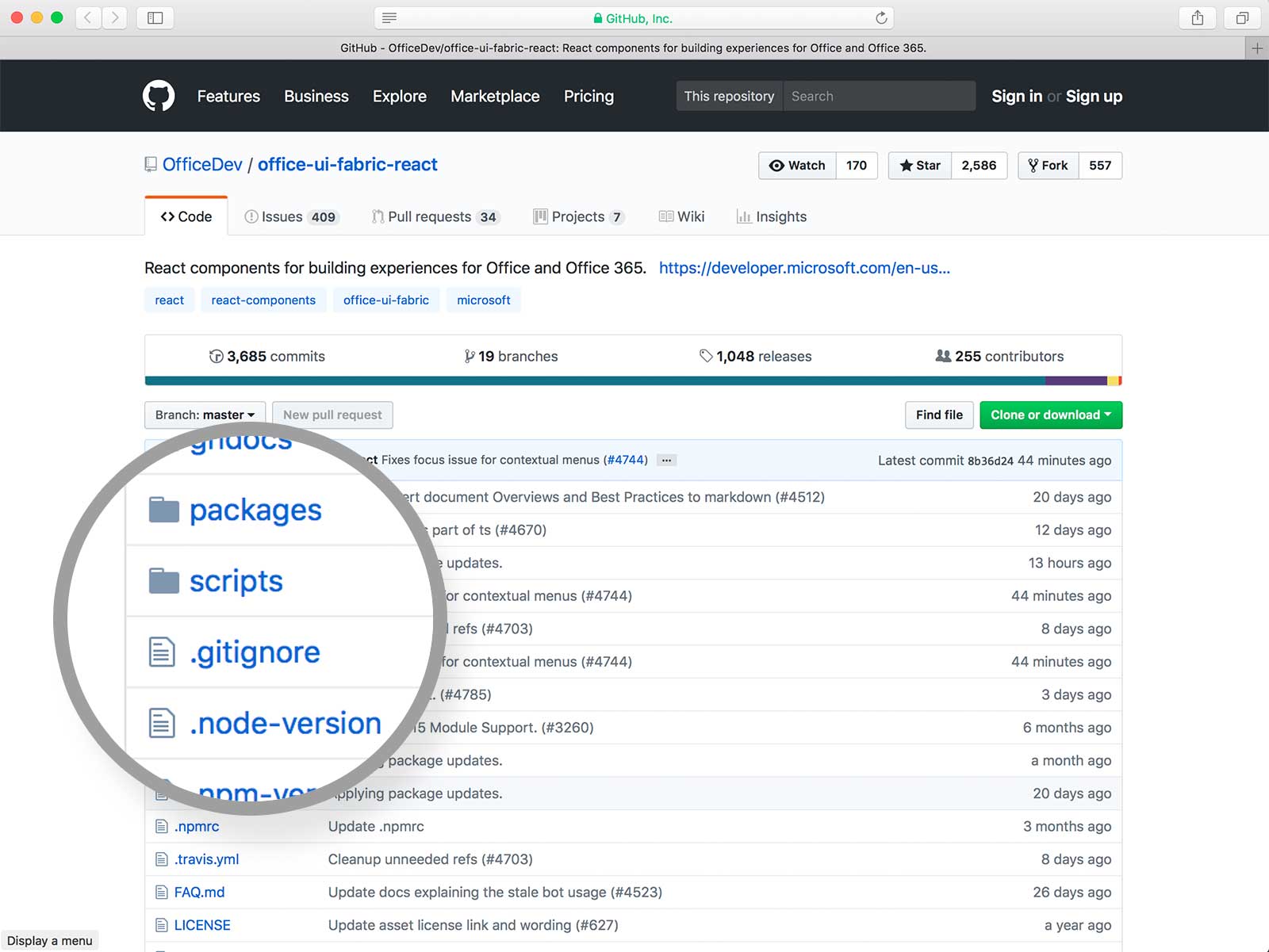
I started by interviewing internal designers and developers who were also users. Since there wasn't an established destination for the devs to store their resources, they threw the code on open source platforms like GitHub. This caused confusion for creative and business owners.
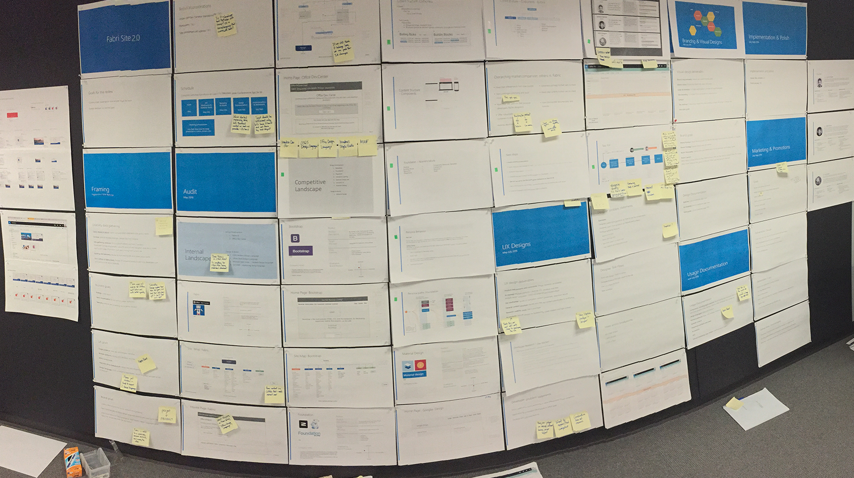
I began researching the Microsoft Dev Center, Material Design, Bootstrap, and Foundation. I compared these platforms, completed a heuristic evaluation, and re-assembled their happy paths. I found the best sites were the ones who were simple and not over-designed. Their sole purpose was dedicated to helping tech designers complete their tasks.
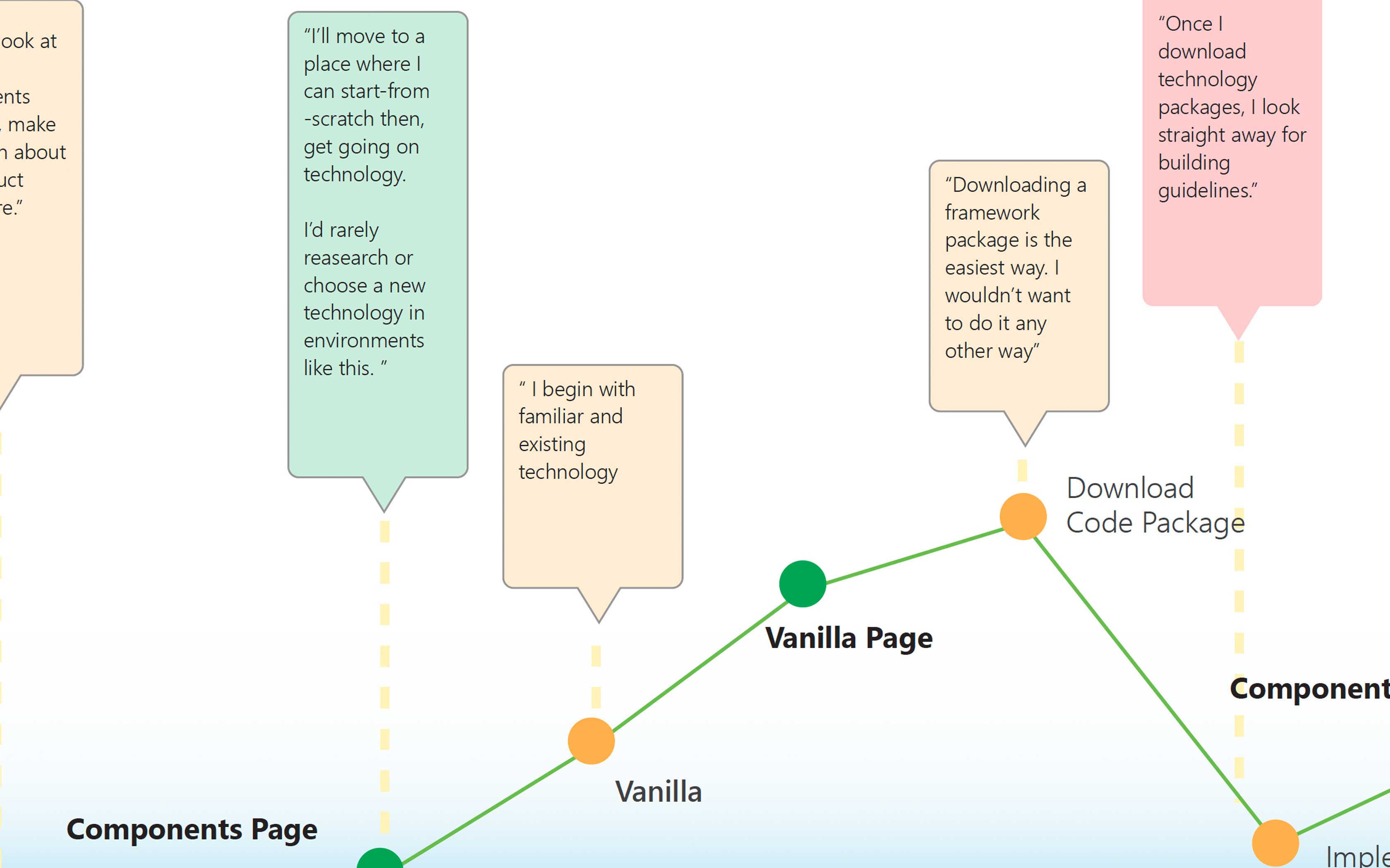
When information gathering was complete, it was clear I needed to make a destination that was designed for designers and developers. My takeaway was that designers look for different queues than developers. For example, coders are looking for code. 95% of the time they need to easily find a string of code and get out. They're not too interested in styles or color. Designers like to browse/absorb content. As they work on a task, they hop around different aspects of the style guide to help them with decisions.

After gathering my research, I proposed we build a responsive website that will live in the Microsoft Developers Center. The site will have clear paths for Designers, Developers, and Managers who need to develop components in their Office Products. I also proposed we create a blog where the studio can post events regarding the product.
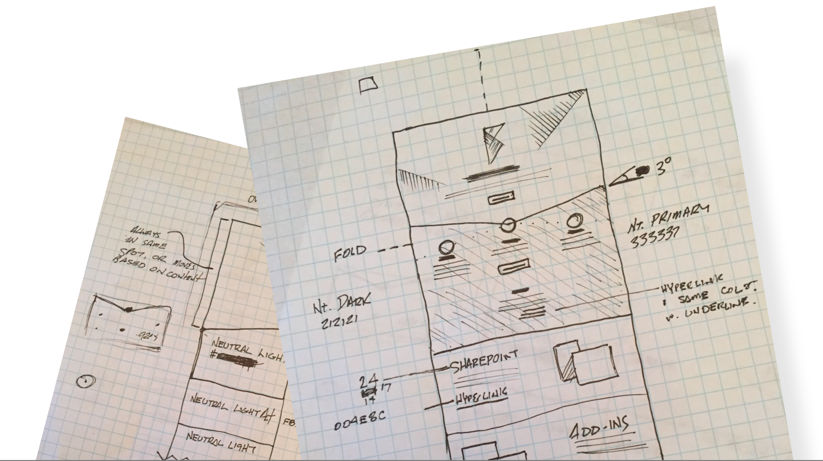
I went through iteration processes where we had to find the right design for new and experienced users.
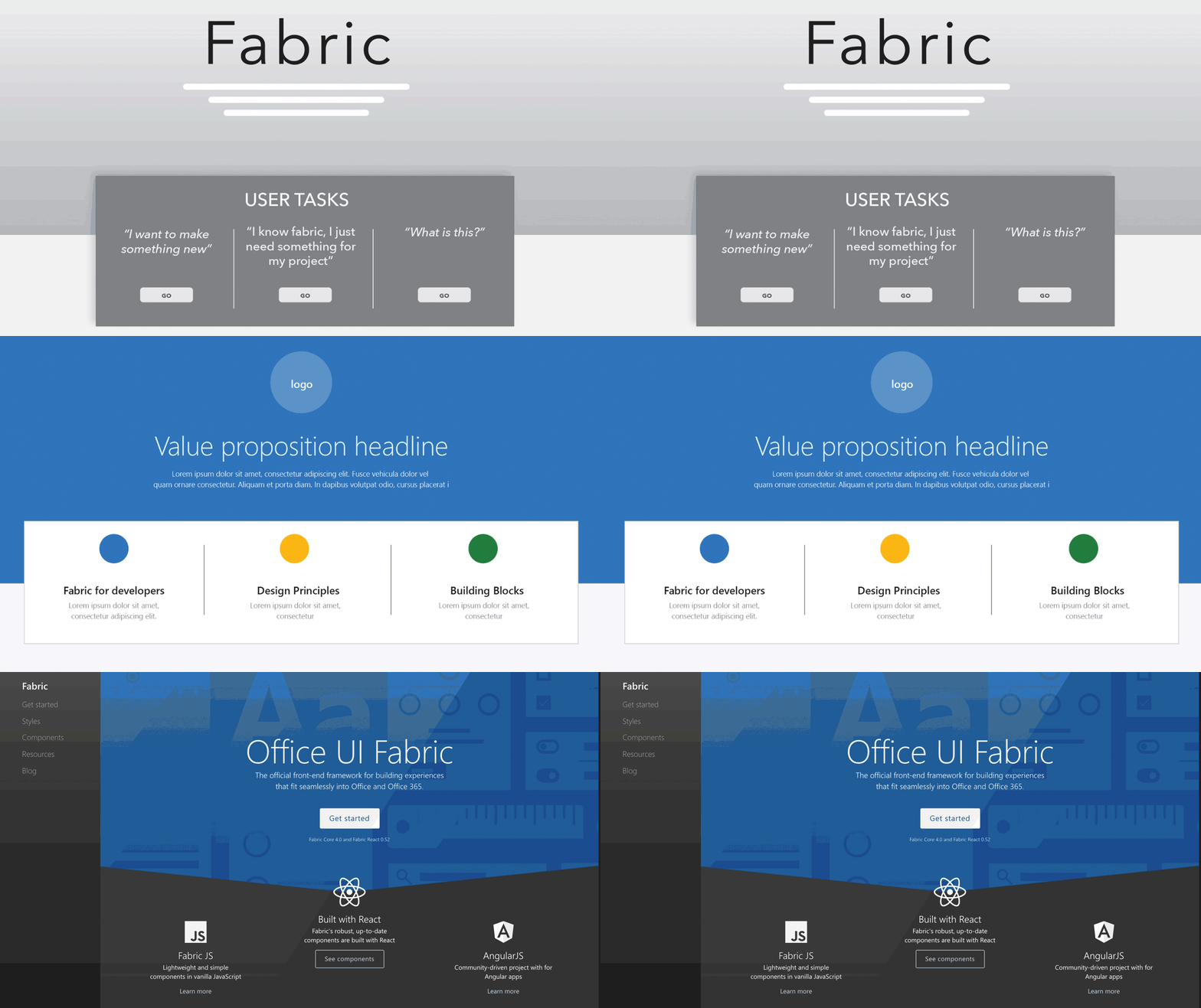
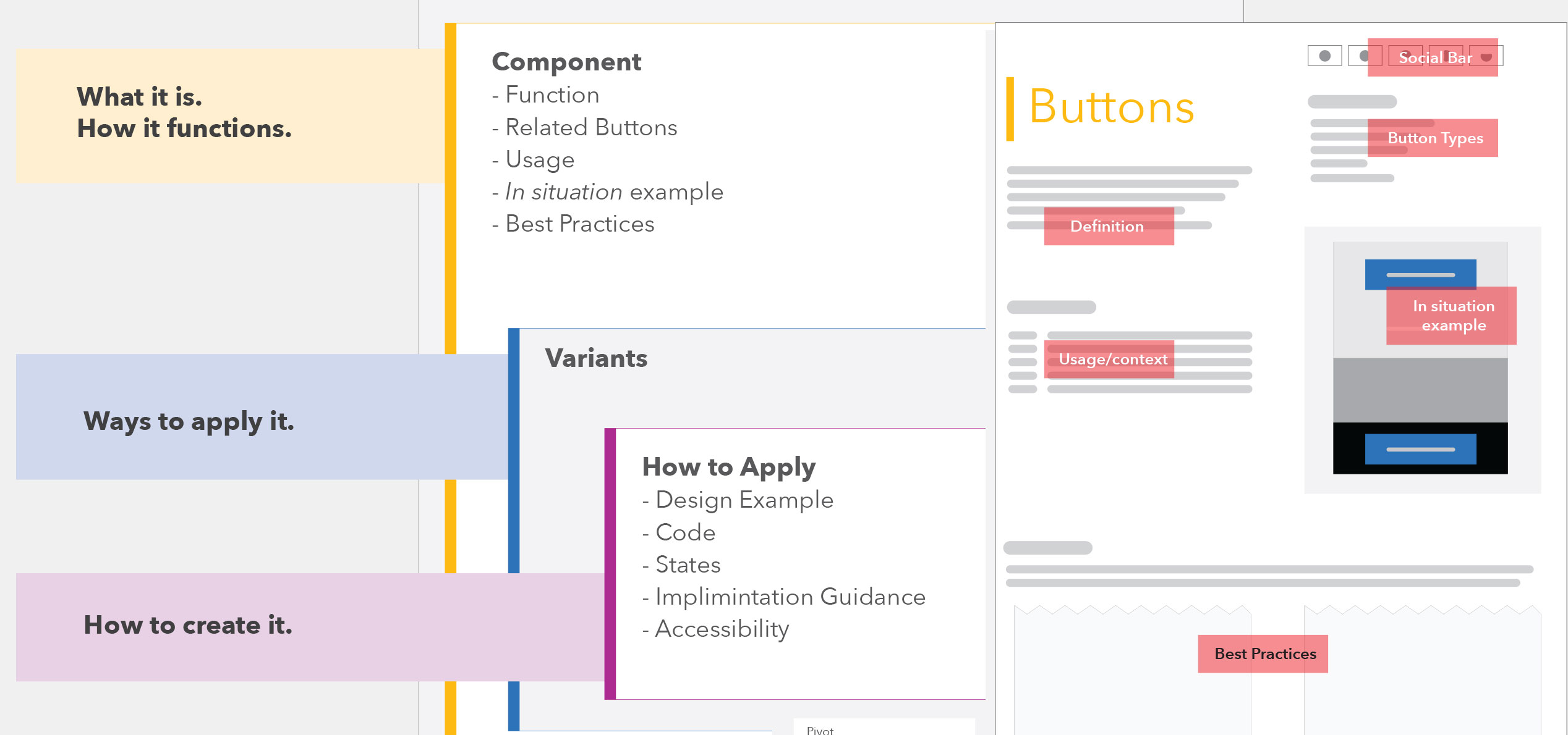
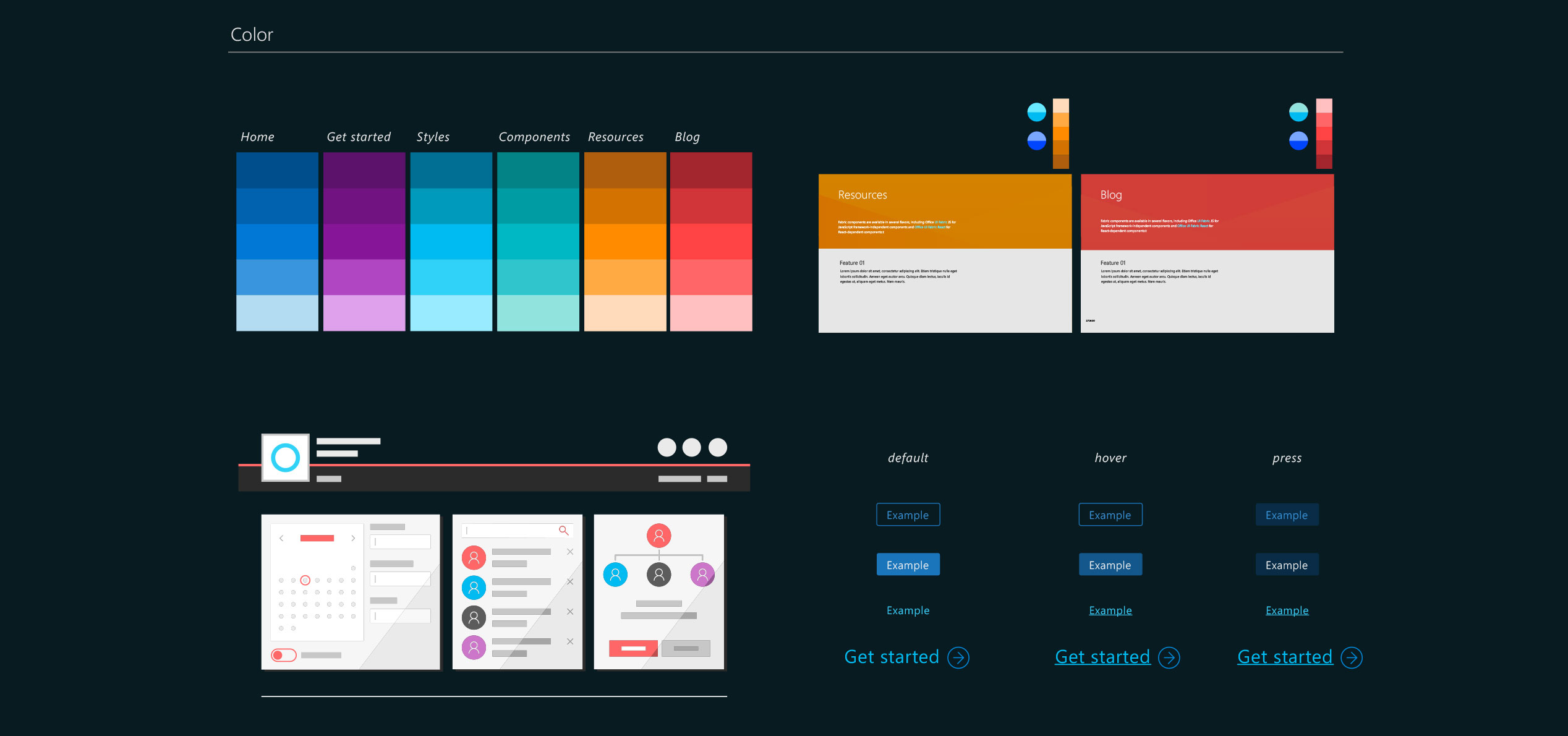
I was the Art Director for the Fabric Project. I wanted to approach the aesthetics with the same patterns I developed for the site architecture. I thought about the context of the user while they were absorbing content. I also considered the elements from the Microsoft Design Language that best suited my product design.
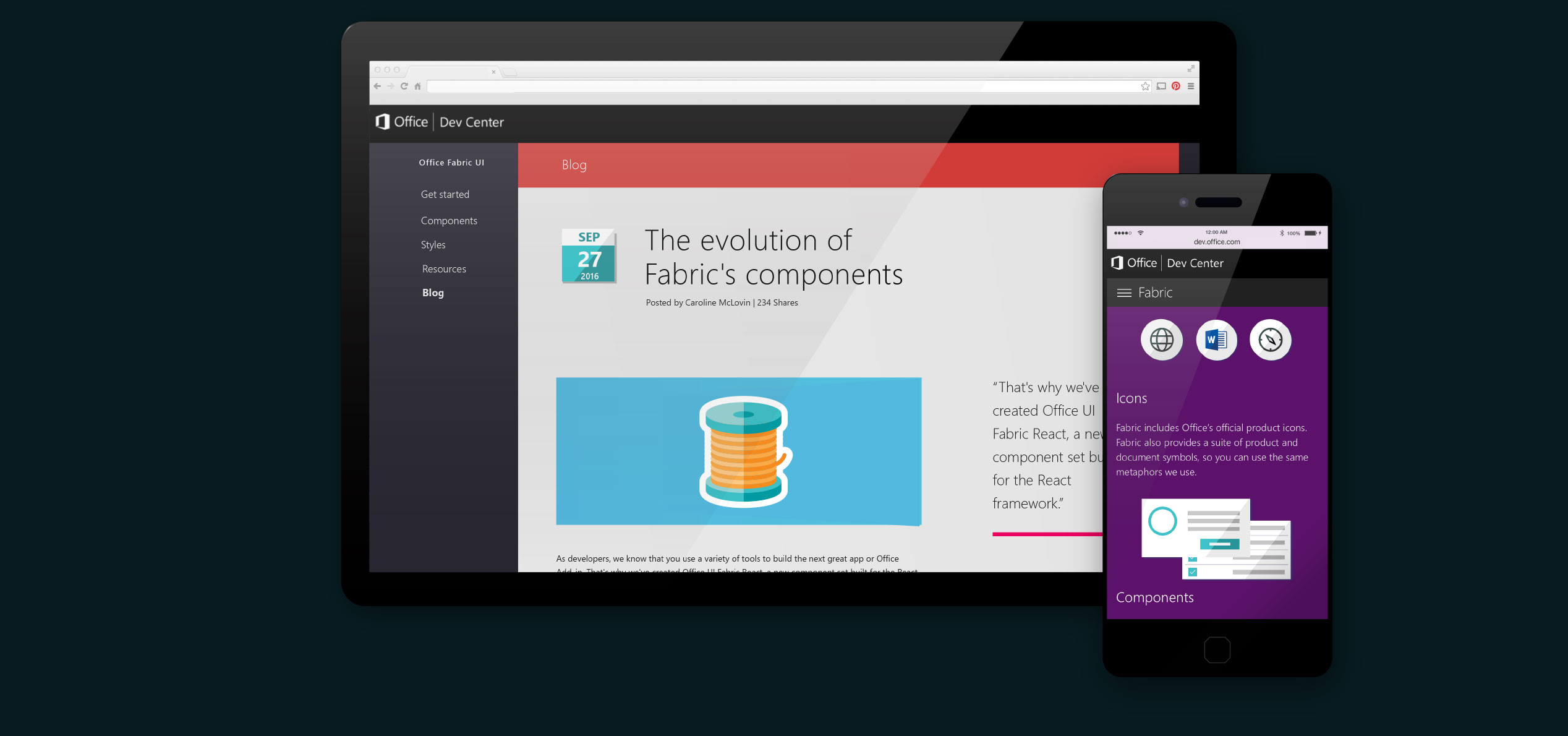
It's always nice when you get to spend a year working with the resources you have at Microsoft. Having access to a talented team is a great experience. We launched the project in the summer of 2016. The first 60 days, the project was released for internal testing with the Office studio designers. This was the first Microsoft Open Source platform where a community of designers has access to once protected Office technology materials. Customers responded well to the tools and future Microsoft groups modeled this site for other framework guidelines.
I'd be happy to have a thorough conversation about my projects.
if you have a project you need help with, contact me at:
